


How to Increase Conversion with Web Designing Practices?
In today’s highly competitive digital landscape, where users have countless options at their fingertips, businesses must focus on increasing conversions. One powerful tool in achieving this is good web design.
A well-designed website attracts users and guides them seamlessly through their journey, ultimately leading to higher conversion rates.
Today, TeCuriosity explores the key practices and strategies that can be employed to optimize conversions through effective web design. We will delve into the various aspects of web design that can significantly impact conversion rates.
By implementing these practices, you can create an engaging and persuasive online presence that drives conversions and enhances overall success.
Let us get into it.
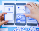
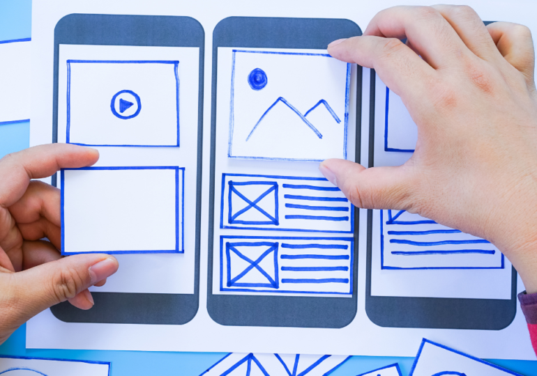
Understanding the Role of Web Design in Conversion Optimization
The Relationship Between Web Design and Conversions
Good design can make or break your chances of converting those valuable leads. It’s like the wingman of your website, helping you seal the deal.
Key Design Principles That Impact Conversions
Certain design principles have a direct impact on your conversion rates. These include clear and concise messaging, prominent call-to-action buttons, and a visually appealing layout. Remember, you want your visitors to feel like they’ve stumbled upon a gold mine, not a confusing maze.
Streamlining User Experience through Intuitive Design Elements
Importance of User-Centric Design
User-centric design is all about putting yourself in your visitor’s shoes. It’s like being a mind reader, understanding their needs and desires.
By designing with the user in mind, you can create an experience that is intuitive, seamless, and enjoyable.
Creating Clear and Intuitive Navigation
Imagine walking into a store where all the aisles are unmarked and products are scattered randomly. Frustrating, right? The same goes for your website.
Clear and intuitive navigation is like a map that guides your visitors to where they want to go. It ensures they don’t lose their way and ultimately increases conversions.
Optimizing Website Load Times
Patience is a virtue, but when it comes to website load times, it’s in short supply. Slow websites are like a bad date – they leave a lasting bad impression.
By optimizing your website’s load times, you can prevent visitors from bouncing off and improve their overall experience. Trust me, they’ll appreciate it.
Leveraging Visual Hierarchy and Typography for Enhanced Conversions
Understanding Visual Hierarchy and Its Impact
Visual hierarchy is like the VIP section of your design. It guides your visitors’ attention and directs them to the most important elements on your page.
By using size, color, and placement strategically, you can ensure your call-to-action buttons and compelling offers steal the show.
Using Typography Effectively to Guide Users
Typography is more than just choosing fancy fonts for your headlines. It’s about creating a fluid reading experience that guides your visitors through your content.
With the right typography, you can emphasize key points, establish credibility, and keep your readers hooked until the very end.
Utilizing Color Psychology in Design for Conversions
Colors have a sneaky way of influencing our emotions and decisions. The appropriate color scheme can evoke trust, excitement, or even a sense of urgency.
By understanding color psychology and leveraging it in your design, you can nudge your visitors toward taking the desired action.
But remember, no pressure!
Optimizing Website Navigation and Structure for Seamless User Journey
Importance of Logical Website Structure
Have you ever been on a website where finding what you need feels like an epic quest? Yeah, no one has time for that.
A logical website structure ensures that your visitors can easily find what they’re looking for. It’s like having a well-organized filing cabinet, except without the paper cuts.
Implementing User-Friendly Navigation Menus
Navigation menus are like the GPS of your website. They guide your visitors through the different sections and pages, saving them from the frustration of getting lost.
A well-designed menu will make browsing your website a breeze, keeping your visitors engaged and increasing the chances of conversion.
Utilizing Breadcrumbs and Search Functionality for Easy Navigation
Breadcrumbs and search functionality are like the secret weapons in your navigation arsenal. Breadcrumbs show your visitors the path they’ve taken, making it easy to backtrack if needed. And the search functionality?
Well, it’s the hero that swoops in when visitors are in a hurry to find something specific. With these tools at your disposal, your visitors will navigate your website like a pro.
Designing Attention-Grabbing Call-to-Action Buttons and Forms
The design of your call-to-action (CTA) buttons and forms plays a crucial role in converting visitors into customers. These elements are like the superheroes of your website, enticing users to take action and ultimately boosting your conversions. So, how can you design them to be attention-grabbing and effective?
Best Practices for Designing Effective Ctas
Creating compelling CTAs is an art form. To make your buttons more clickable than a catchy meme, consider these best practices:
– Make them visually striking: Use contrasting colors that stand out from the rest of your site’s design.
– Keep them concise: Use clear and action-oriented language that leaves no room for confusion.
– Make them prominent: Place your CTAs in strategic locations, such as at the end of an engaging piece of content or above the fold.
– Use relevant visuals: Incorporate icons or images that align with the purpose of the CTA to make it more appealing.
Creating Persuasive and Actionable Form Designs
Forms are essential for capturing information from your visitors, but they can also be a stumbling block if not designed thoughtfully.
To ensure your forms are persuasive and easy to complete, consider the following tips:
– Keep it short and sweet: Ask for only the necessary information and avoid overwhelming users with too many fields.
– Use clear and concise labels: Make it crystal clear what you’re asking for in each field.
– Provide real-time feedback: Use inline validation or tooltips to help users fill out the form quickly and avoid frustration.
– Streamline the submission process: Make sure the submit button is easily visible and labeled appropriately to encourage users to take that final step.
Using Micro-Interactions to Increase Engagement
Microinteractions are the small interactions that users have with your website, such as hovering over a button or scrolling through a page.
These subtle yet delightful animations can greatly enhance user engagement. Consider incorporating micro-interactions into your design to add that extra touch of interactivity and make your website more memorable.
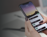
Enhancing Mobile Responsiveness to Capture Mobile Users’ Attention
In today’s mobile-dominated world, ensuring your website is optimized for mobile devices is crucial for capturing the attention of on-the-go users. Here’s how you can enhance your mobile responsiveness to improve conversions.
Implementing Responsive Design Techniques
To make your website shine on every device, consider the following responsive design techniques:
– Use fluid layouts: Design your site to adapt to different screen sizes by using percentage-based widths instead of fixed pixels.
– Prioritize content: Make sure the most important information is easily accessible on smaller screens, and remove any unnecessary clutter.
– Optimize images: Compress images to ensure fast loading times on mobile devices without sacrificing quality.
– Test, test, and test: Don’t assume your website looks great on mobile. Test it on various devices and make adjustments as needed.
Mobile Optimization Best Practices for Better Conversions
Optimizing your website for mobile goes beyond just making it look good. Consider these best practices to maximize conversions:
– Implement touch-friendly elements: Ensure buttons and links are large enough to be tapped with ease and minimize the need for pinch-zooming.
– Simplify navigation: Mobile users want quick solutions, so prioritize clear and intuitive navigation.
– Speed up load times: Mobile users are often on the move and have limited patience, so optimize your site’s performance to load quickly.
Incorporating Trust Signals and Social Proof for Building User Trust and Confidence
In today’s digital landscape, building trust with your users is paramount. Incorporating trust signals and social proof into your website establishes credibility and instills confidence in your brand.
Building Trust Through Trust Signals and Social Proof
Trust signals are visual cues that reassure users that your website is trustworthy and secure. These can include trust badges, security seals, certifications, or affiliations with reputable organizations.
Social proof, on the other hand, is evidence that others trust and endorse your brand, such as customer testimonials, reviews, or case studies.
By using trust signals and social proof, you can alleviate any doubts your visitors may have and increase their trust in your business.
Using Customer Testimonials and Reviews to Establish Credibility
Customer testimonials and reviews are like glittering gold mines in the world of trust-building. Showcase positive feedback from satisfied customers to give potential customers a glimpse of your fantastic products or services.
Consider featuring testimonials prominently on your homepage or product pages to create an instant sense of trustworthiness.
Leveraging Trust Badges and Security Seals to Reassure Users
Trust badges and security seals are like the bouncers at the entrance to your website, assuring users that their personal information is safe and secure. Display these badges prominently, especially during the checkout process.
Summing Up
By understanding the relationship between design and conversions, your business can create a website that not only attracts users but also guides them toward taking desired actions.
Continuously refining and improving the design based on data-driven insights will lead to higher conversion rates.
Effective web design is more than aesthetics; it is about creating a seamless user journey that converts visitors into loyal customers.
So, go forth and design with purpose!
Tech enthusiasts, unite! Subscribe to TeCuriosity’s newsletter and stay plugged into the rapidly evolving world of technology. Join the revolution!
FAQ
Good web design plays a critical role in increasing conversions. It helps create a visually captivating and user-friendly website that guides visitors toward desired actions. By optimizing the design elements, improving user experience, and implementing persuasive call-to-action buttons and forms, businesses can significantly enhance their conversion rates.
Some key design principles that impact conversions include visual hierarchy, typography, color psychology, and intuitive navigation. Visual hierarchy helps prioritize content and guide users towards important elements.
Typography enhances readability and guides users through the page. Color psychology can evoke desired emotions and influence user decisions. Intuitive navigation ensures users can easily find what they are looking for, reducing friction and increasing conversions.
A/B testing involves comparing different versions of a web page to determine which design or content variation performs better in terms of conversions.
By testing and analyzing different elements, such as headlines, CTAs, layouts, and colors, businesses can identify the most effective design choices. Analytics provide insights into user behavior and conversion rates, enabling informed design decisions and continuous improvement to maximize conversions.
With the increasing use of mobile devices, having a mobile-responsive website is crucial for conversions. Mobile responsiveness ensures that the website adapts and functions seamlessly on various screen sizes and devices.
By providing a user-friendly mobile experience, businesses can cater to mobile users and capture their attention, leading to improved conversions.